Learning Calligraphy Basics: The Complete Beginner’s Guide
Where do I start learning calligraphy?
On this page I’m offering a comprehensive overview of calligraphy basics for you to get well equipped and ready to start your journey. I hope you’ll travel with me!
CALLIGRAPHY BASICS
Table of Contents
1. How can I get started with learning calligraphy?
There are many different approaches you can take about starting your calligraphy journey. Here are three I recommend to my students.
1.1 Is there one particular style you are very passionate about?
Start from there! It will help you stay motivated and hungry for knowledge. Once you dive in deep enough, you’ll start to realise the connections between this particular script and other styles, and you’ll want to expand your knowledge by learning more calligraphic hands.
1.2 Do you have a print or cursive handwriting?
You can start by learning a style that feels closer to your own letterforms, as it will feel more familiar. If this is your case, here are my recommendations.
For print style handwriting, I recommend starting with an “Intro to Foundational Hand”. This course covers the foundations of our current roman style capitals and lowercase alphabets.
For cursive handwriting, I recommend starting with an “Intro to Italic calligraphy”. If your handwriting is cursive AND connected, then I recommend starting with an “Intro to Copperplate Calligraphy” as this course will teach you about connected alphabets.
1.3 Chronological order
If you don’t have a particular style that you are passionate about, and don’t write by hand often, my third recommendation is learning calligraphy in a historical order.
This will show you the evolution of the letters connected to other visual art forms such as painting, sculpture, architecture, fashion… all being transformed by the technological advancements and/or trends of each era. This approach comes with a bonus if art history is your gem!. For this case scenario, my recommendation is starting with Roman Capitals which is part of my “Intro to Foundational Hand Course”.
There are no right or wrong ways to start learning calligraphy, it is just about choosing one style and enjoy your learning process!
2. Can you learn calligraphy on your own?
Absolutely yes! You can learn almost anything on your own, specially in the internet era! What are the main challenges of a self-taught pathway? In my opinion, the three listed below.
2.1 Finding reliable resources
Nowadays we are constantly bombarded with information, and if you are starting, it is tricky to identify which sources are solid and reliable, and which ones are crafted by cowboys or AI. For this reason, I have created a calligraphy books section to guide you in your first steps at learning calligraphy.
2.2 Keeping Yourself Motivated
If you are on your own, it can be difficult to keep up your motivation. One way is to join a community with like-minded people and interests, where you get to share your work and see other student’s progress.
Another way to keep yourself motivated is what I call “progress is the inspiration”. I have been writing calligraphy regularly since 2011. I always date and archive all my calligraphy practice. When I’m not too sure about my progress, I pick up a piece done one, two or five years ago and I redo it. Then, I place both pieces next to each other and take a photo. The result is that the progress becomes the inspiration to keep going, why? Because there is only one direction, and it is always forward! Basically you cannot get worst than when you started, example below.
2.3 Keeping yourself accountable
Another challenge of the self-taught journey is to keep yourself accountable. Between 2011 and 2013 I worked as a full-time textile designer. I had no formal education, and I had no idea how to do the job. This was my first experience learning on my own with the help of Google and Youtube. Why did I learn so much and so quickly? Because I had real clients with real deadlines.
This not-so-ideal situation made me hyper focus, looking for concrete solutions to every briefing I received, forcing me to be accountable. Sometimes I had three days to deliver a textile design; other times I had three weeks to complete a project. These briefings became real outcomes for real clients with a specific timeframe, with no room for me to get lost along the way. In my first two years as a self-taught textile designer I produced 432 designs.
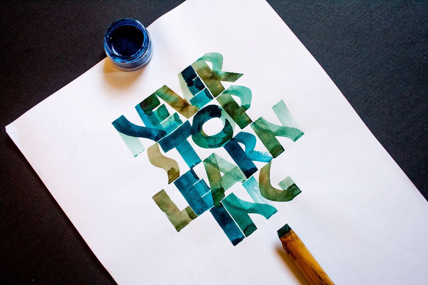
In calligraphy —and in any other creative field— we can make a distinction between regular practice and outcome. It is very important to practice —ideally you want to do it weekly if not daily. But it is equally important to produce a piece of work. This can be anything: a postcard, an envelope, a greeting card, a poem, a quote to place on your bathroom’s mirror, a logotype, an instagram post with its description… anything!
When you plan a project you move from your ‘comfort seat’ to the ‘art director, editor, creator and self-critic seat’ producing something for someone —or for yourself— with a specific publishing calendar. So, how are you going to keep yourself motivated and accountable? Map out a calendar of projects and deadlines and stick to it no matter what!
3. How long does it take to learn calligraphy?
Learning calligraphy can be a lifelong journey. The secret? Enjoy the process, archive and date your work and use it as a motivational engine to propel yourself forward. As I mentioned above, my personal motto is “progress is the inspiration”.
Some of my students are learning calligraphy with the objective of turning it into a business and make money out of it. My answer? Think of it as an academic degree. If you go to uni to study Graphic Design, most of the programs will be three to four years long. After graduation, you’ll start working as a junior graphic designer and will be making money for the first time.
My partner is a self-taught web designer and SEO specialist. He has learnt everything at the university of Youtube, and still took three to four years for his business to take off.
3.1 What is your motivation for learning calligraphy?
Is it a hobby after work? Is it a complimentary skill to your typography and/or lettering work? Is it for mindful and meditative purposes? Is it a “combinatory play” to get some creative juices going? Is it for crafting your own wedding invitations?
Regardless if you would like to make money out of calligraphy or you don’t, the learning journey never ends, so get ready for an enjoyable creative marathon!
4. What are the best calligraphy materials for beginners?
And the answer is… “It depends!”. Mostly, depends on the calligraphy style that you would like to learn. More on calligraphy styles here!
Most calligraphy styles or calligraphic hands are done with a broad-edge pen, but not all! Copperplate and Spencerian on the contrary, are currently executed with a pointed flexible nib. The distinction between broad-edge and pointed writing tools is only a modern concept, but we won’t dive too deep about it just yet!
Head the calligraphy supplies section on this site, where you'll find a comprehensive list of materials I recommend for beginners.
4.1 Essential materials guidebook for beginners
You can download a PDF file with a visual list of materials linked to each specific calligraphy style I teach. Introduce the coupon code YOUTUBE for a free download!
4.2 Broad-edge writing tools
In this video, I talk about different broad-edge calligraphy pens and writing tools you can use. Learn more about calligraphy pens.
4.3 Contemporary broad-edge calligraphy styles
In the video above, I talk about different broad-edge calligraphy pens and tools you can use for multiple calligraphy styles, including:
- Skeleton Roman Capitals
- Brush Roman Capitals
- Rustica
- Uncial and Half-Uncial
- Insular or Celtic calligraphy
- Carolingian
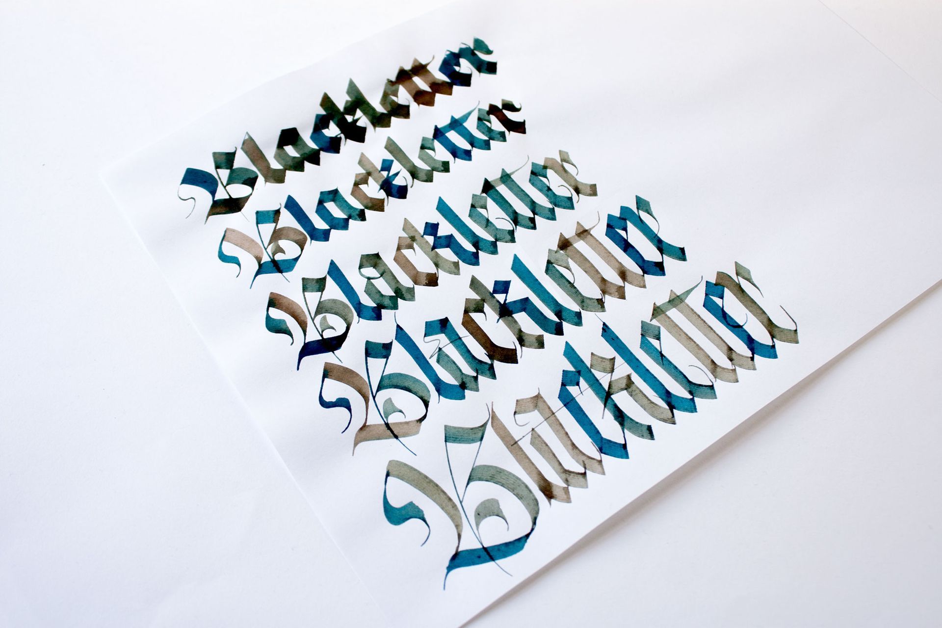
- Blackletter or Gothic calligraphy
- The Humanistic Minuscule
- Italic
- Gothicized Italic
- Neuland calligraphy
4.4 Pointed flexible nibs
Watch this video with my pointed flexible nib recommendations for beginners.
4.5 Contemporary pointed flexible calligraphy styles
Below, you’ll find a short list of styles that are currently executed using a pointed flexible tool, be it a metallic nib or a brush pen.
- Copperplate
- Spencerian
- Modern Calligraphy
- Engrosser’s Script
- Showcard and ticket writing (round brush)
- Script brush calligraphy and script brush lettering
Obviously, there are more styles, but these are the greatest hits so to speak!
5. What is the best paper for calligraphy?
And the magic answer again: “It depends!”.
- Depends on the style of calligraphy
- Depends on the context: what is it for?
- Depends on the desired outcome
As a beginner's rule of thumb, these are my go to types of paper for my daily calligraphy practice:
- 70gsm marker or bond paper for Copperplate calligraphy
- 90gsm laid paper for any other calligraphy style
- 80gsm 100% recycle copy paper
For a final calligraphic work while keeping the costs moderately down:
- Canson XL 300gsm watercolour paper
- Canson Basik 370gsm watercolour paper
- Italian handmade paper
- Any other fancy papers that work with your ink and nib nicely!
Learn more about paper in my article title "A Calligrapher’s Guide to Paper: Choosing the Right Surface for Your Practice".
5.1 Tutorial: Alternatives types of paper for Copperplate calligraphy
See below a tutorial elaborating on types of paper. And for a comprehensive list of supplies, go to my recommended calligraphy supplies page.
I personally struggle with this subject the most while writing Neuland and Blackletter.
My advice?
Add vertical lines into your blank guidelines to have a clear reference. Additionally, be aware of the slant coming out of your hand, and avoid writing letters that fall backwards or move forward if that’s not the desired outcome! More on the slant/slope concepts below.
7. What is slant or slope in calligraphy?
7.1 Slant
In calligraphy, slant refers to the angle at which the strokes of the letters are tilted or inclined. This angle is typically consistent throughout a script style and helps define its overall aesthetic and character.
For example, in Copperplate calligraphy, a popular pointed pen script, the slant is usually around 55 degrees to the baseline. The slant gives the writing a flowing, elegant look, and maintaining a consistent slant is essential for achieving harmony and balance in calligraphic compositions.
Slant can vary depending on the script style:
- Italic scripts also have a noticeable slant, though typically less steep than Copperplate.
- Roman scripts often have no slant, with more upright letterforms.
Maintaining a uniform slant is one of the key challenges for calligraphers, as it requires precision and control over the angle of the pen or the writing instrument.
7.2 Slope
In calligraphy, slope refers to the angle or degree of inclination of the letterforms relative to the horizontal baseline, similar to the concept of ‘slant.’ It describes the overall tilt of the strokes or the entire script as a whole. The term ‘slope’ is sometimes used interchangeably with ‘slant,’ but they both indicate the angle at which letters are written.
7.3 Tutorial: Slant/Slope Explained
In this detailed tutorial I define the slant/slope of Copperplate calligraphy in relationship to the slow or fast movements or our hand. I also talk about the axis we use to measure the slant in calligraphy versus in typography. Finally, I demo the word ‘hunt’ using different slants and the position of my arm and my pen at each of them.
8. What is muscle memory?
Muscle memory refers to the process by which the brain encodes specific motor tasks through repetition, allowing the body to perform those tasks automatically, without conscious effort. It's not actual memory stored in the muscles, but in the brain, particularly in areas like the cerebellum and motor cortex.
Muscle memory is developed when you practice an activity—such as writing calligraphy, typing, playing a musical instrument, or riding a bicycle—over and over. Over time, the motions become automatic, enabling you to perform them with ease and accuracy without actively thinking about the steps involved.
You can watch this super interesting video about it!
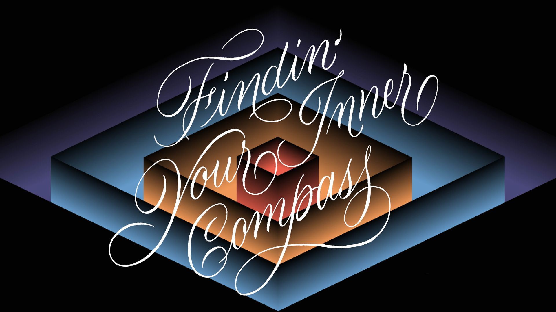
9. What is iPad calligraphy?
iPad calligraphy is the art of creating calligraphy digitally using an iPad, typically with the help of a stylus like the Apple Pencil and specialised apps such as
Procreate,
Calligraphy Practice, or
Adobe Fresco. It blends traditional calligraphy techniques with modern technology, offering a flexible and innovative way to practice and create stunning lettering.
9.1 Features of iPad Calligraphy
- Customisable Brushes: Apps like Procreate allow you to mimic the texture and stroke of traditional calligraphy tools (e.g., dip pens, brushes) through digital brushes. You can adjust size, pressure sensitivity, and opacity to achieve a realistic effect.
- Layering: iPad apps support layers, enabling you to draft, refine, and perfect your work without altering the final strokes. This is particularly helpful for building compositions or experimenting with designs.
- Undo/Redo Options: Unlike traditional calligraphy, where mistakes often require starting over, iPad calligraphy allows you to undo errors instantly, saving time and materials.
- Versatility: iPad calligraphy can be used to create everything from digital wedding invitations to social media content, logo designs, and art prints.
- No Mess: Since it's digital, there's no need for ink, paper, or cleaning tools, making it convenient and portable.
9.2 Downsides of iPad Calligraphy
- Not the real size: Working in smaller sizes is not a real thing, as you can always zoom in to see the letters as big as you want them to be.
- Losing yourself in the details: Because you can zoom in anytime you want, you can easily get distracted in the details instead of being more efficient.
- Smoothing the DNA of your strokes: If you activate the functionality of smoothing your strokes, you’ll think the flow of your hard is better than the reality. So if you attempt the same curves on paper, you’ll probably have an undesired experience.
- Creating gradients: There is no randomness and spontaneity of mixing colours as you go, producing a unique and original result.
- Presence:
Being fully present on the page won’t have the same quality, as you know there is always a ‘control z’ function available.
9.3 Benefits of iPad Calligraphy
- Environmentally Friendly: Reduces the need for physical supplies like paper and ink.
- Portable: Everything you need fits in one device, making it ideal for on-the-go creativity.
- Learning Resources: Many apps include built-in guides, practice sheets, and templates to help beginners learn calligraphy styles such as Copperplate, Modern Script, and Gothic.
9.4 Calligraphy vs. iPad Calligraphy: Personal thoughts?
Use the tool that works best for you, or the one that is a better fit for your desired outcome, as far as you are aware of the pros and cons described above!
Let’s start with the very basics: What is a font?
In digital typography, a font is typically a file (software) that instructs computers and printers on how to display/print the characters in the chosen style.
A font refers to the specific version of the typeface, including attributes like size and weight. For example, Arial Bold 12pt is a font.
On the other hand, a typeface refers to the overall design of the characters (like Calibri, Times New Roman, or Helvetica).

10.1 Calligraphic font styles
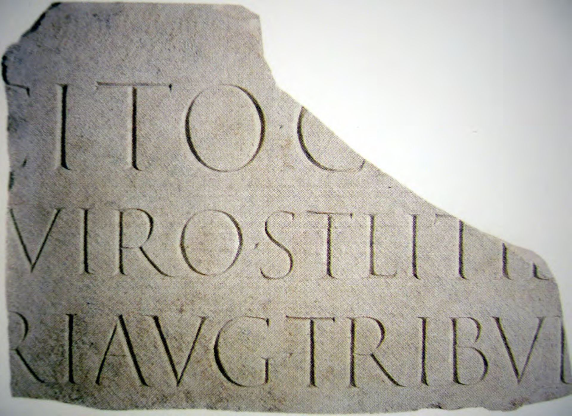
A calligraphic font is an alphabet heavily influenced by calligraphy. For example, think of the magnificent Trajan Column from the 1st century AD in Rome, which is believed to have been first written with a broad-edged brush on the column and then incised into the stone using a chisel and a mallet (more on this topic here). Then, check out the font called Trajan (featured above) designed by Carol Twombly. This serif font is a close interpretation of the incised letterforms, and follows the ‘Old Style Proportions’ featured on the original Roman inscription.
On the other hand, a calligraphic font for many people means an elegant, expressive or casual handwritten alphabet (picture modern calligraphy here).
To add more sauce into the mix, you’ll find that some font distributors/font foundries (Adobe Fonts, Figma, Canva, My Fonts...) use different labels to classify type and the names of ’calligraphy’, ‘handwritten’, ‘hand‘ or ‘script’ may be used interchangeably! More on type classification below.
10.2 Humanistic font styles
Some font styles can also be referred to as ‘Humanistic’ because their origins date back to the Italian Renaissance (15th Century) and the first ‘Humanistic metal types,’ which have roots in The Humanistic Letter (or Modern Carolingian calligraphy style).
These styles show evidence of a human hand holding a pen, evoking a feeling of warmth and personality. You'll find Humanistic Sans and Humanistic Serif font styles, such as the beautiful Centaur or Jenson (featured here) designed by Robert Slimbach.


10.3 Script fonts
If you use Adobe Fonts, you’ll see they classify fonts as ‘Script’ to feature connected alphabets, and ‘Hand’ for fonts that carry the mark of a contemporary handwritten pen in their DNA. You can also activate their ‘Calligraphic’ tag for fonts that are closer to a cursive or continuous style.
If you use Canva, they have two labels, ‘Handwriting’ and ‘Brush,’ which filter fonts that are heavily influenced by those tools in both their look and feel.
The font featured here is called Ballet Regular, designed by Maximiliano Sproviero and developed by Eduardo Tunni from Omnibus Type. This is what many people have in mind when they hear ‘calligraphic font,’ sometimes pejoratively referred to as ‘wedding fonts’... but don’t even get me started on that subject!
STUDENTs'
Testimonials
I was greatly impressed by the course. Marija provided us with a wealth of knowledge and resources to assist us in the future. It was evident that she is genuinely invested in our learning and our progress throughout the course. Additionally, she is incredibly kind and pleasant. I do wish the course were longer so that we could delve even deeper into the subject matter.
⋆⋆⋆⋆⋆
Neža Kovač
I completed Maria's Copperplate Calligraphy course online. The classes move at a good pace, and the use of the camera allows for up-close views of the demonstrations. It was a privilege to be a part of a class where Maria shared so much of her own knowledge and skills.
⋆⋆⋆⋆⋆
Jeanette Power
More knowledge and self confidence, with the course “Pump up your Copperplate”.
Maria explains the rules in great detail. Just like on her
YouTube channel. After each module, she adjusts her extensive feedback to my personal learning process.
This way I get to know the basic rules much better than before. That means that I can vary. My texts are getting livelier, but still consistent.
Maria, i am looking forward to the last modules!