From Analogue to Digital Design: Bridging the Gap Between Blackletter Calligraphy and Vector Art
We often think of calligraphy and digital design as two separate worlds. On one side, you have the messy, tactile joy of ink on paper. On the other, the clean, infinite precision of vectors. But my favourite way to work is right in the middle —bridging the gap between the two.
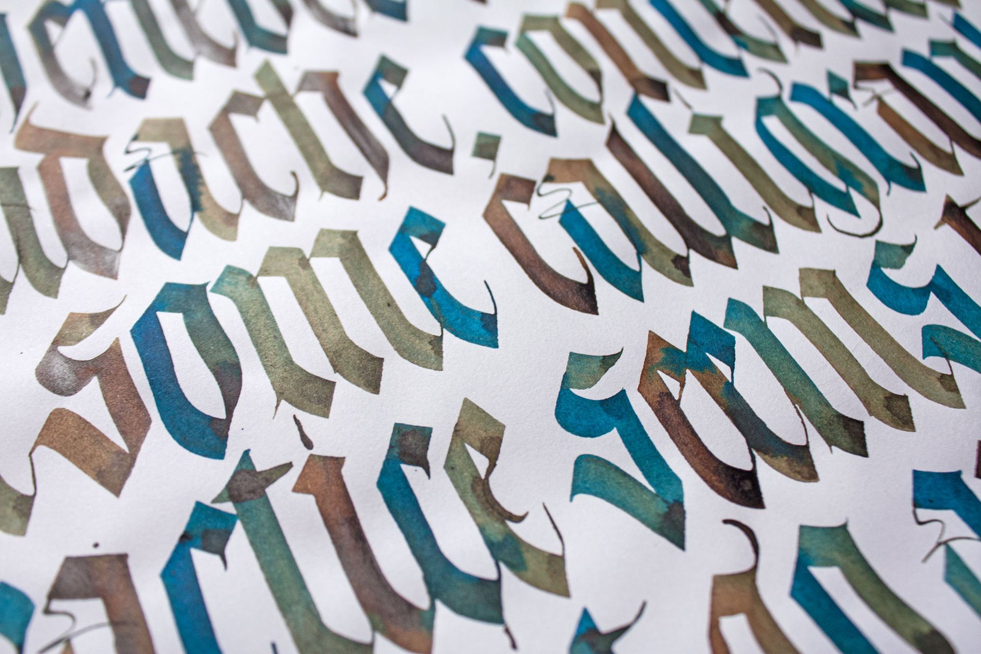
In my latest “Behind the Scenes” video, I’m breaking down a personal project I created for International Women’s Day, based on a quote by Rosa Luxemburg. It started as a Blackletter calligraphy study and evolved into a polished, textured digital piece.
Whether you are a calligrapher looking to digitise your work or a designer wanting to add more “hands” to your lettering, this workflow will show you how to blend the best of both worlds.
Watch My Process
I'm really excited to share with you all a new calligraphy conference and event coming up in Spain in 2026 organised by a very talented dear friend of mine called Sonia Beroiz.
Photography credit: Jimena Cuerva.
Video credit: "From Blackletter calligraphy, to vector lettering to the final pixel-based design" tutorial.
Phase 1: The Analogue Foundation (Thinking with Your Hand)
Every lettering piece I design starts with about 90% of its DNA on paper. For this project, I knew I wanted the rigid, rhythmic structure of Blackletter calligraphy.
I started by warming up with a Pilot Parallel Pen (6mm and 3.8mm). At this stage, I’m not trying to make a finished piece of art; I am just getting familiar with the text, the x-height, and the ascender and descender proportions.
The “Old School” Layout Trick
You’ll see in the video that I use a technique that might seem a bit "1900s" to some of you! I wrote the sentence, realised it wasn't centred, and instead of rewriting it immediately, I physically cut the paper and aligned it manually using a central axis.
There is no "undo" button on paper, but scissors and tape are the next best thing.
Once I had the layout, I used tracing paper and a portable light box to refine the composition. This is where I start "thinking with my hands"—making decisions about ligatures (like the double 'f' in 'different') and ensuring my verticals are completely upright.
Phase 2: Vectorising the Shapes
Once the sketch was solid, I scanned it and moved to the computer.
I used Glyphs (a font design software) to vectorise the shapes, though you can easily use Adobe Illustrator for this as well. The goal here is cleanup and refine. Calligraphy on paper has texture and a warm human quality, but vectors are mathematicala and can be very cold at first.
I refined the curves, fixed the spacing, and established the "skeleton" of the design.
Note on editing:
You’ll notice in the video that I originally designed the author’s name (“Rosa”) as part of the lockup. However, once I saw it digitally, I realised it made the piece too busy. Part of the digitalisation process is knowing what to delete to let the main message breathe.
Phase 3: The Pixel Finish (Procreate)
This is where the magic happens. Vectors are precise, but sometimes it can feel a little too perfect—almost sterile. To bring back the warmth of the original calligraphy, I moved the vector file into Procreate on the iPad.
I didn't just colour it in; I actually redrew details on top of the vector forms.
- Adding Texture: I added a layer of grain to mimic the bite of ink on textured paper.
- Refining Details: I softened the sharp vector edges and added "branches" inside the capital letters to give it a unique character.
- Depth: Using the brush tools, I added subtle shading to the ascenders and stroke endings.
The Final Result
The final piece is a hybrid. It has the structural integrity of a vector lettering, but the soul of a hand-written blackletter calligraphy piece.
I used the final design as the header for my newsletter discussing International Women's Day (which you can read more about here).
I hope this breakdown encourages you to mix your media. Don't be afraid to cut up your paper sketches, and don't be afraid to take your clean vectors back into a pixel app to rough them up again.
Tools Used
- Pilot Parallel Pen (6mm & 3.8mm)
- Canson XL Marker Paper 70gsm
- Tracing Paper & Lightbox
- Mechanical Pencil & Precision Eraser
- Glyphs App
- Adobe Illustrator
- Procreate App
Hey! I'm Maria Montes, a Catalan-Australian multilingual, multicultural designer, calligraphy-and-type educator. My creative practice is set by the principles of never stop learning, sharing knowledge and create emotion through my work.
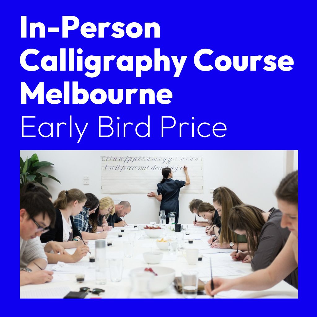
I have been teaching calligraphy independently since 2014. My favourite way of learning is by teaching others. I offer in-person and online calligraphy and lettering courses, corporate in-house workshops, as well as private one-to-one tuitions.


